8 Ways to Boost Sales with Visual Merchandising
Retail stores rely heavily on the success of their visual merchandising. When implemented effectively, visual merchandising is what gets customers through the door, and keeps them in the store long enough to make a purchase.
So what exactly is Visual Merchandising (VM)?
Visual merchandising is the practice in the retail industry of developing floor plans and three-dimensional displays in order to grab attention and maximise sales. It’s an important component of customer experience and your brand's identity.
Types of visual merchandising
In the retail industry, there are numerous types of visual merchandising. Let's have a look at some of the most common examples of visual merchandising.
Display Windows
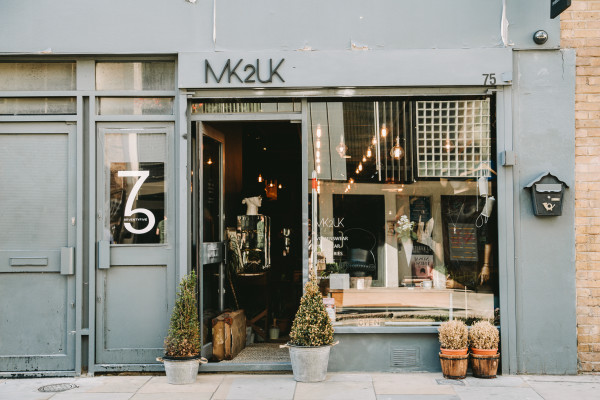
In retail stores, display windows are generally glass enclosures on the exterior of the walls of your store. They are often used to showcase current items to attract customers walking by, and portray the spirit of your brand.
Store Layout
Your store layout can play a big part in effective visual merchandising. Along with display windows, the front of your store will be the first physical interaction a customer has with your store. So making sure your layout is done in a way that helps direct customers to stay longer.

Mannequins
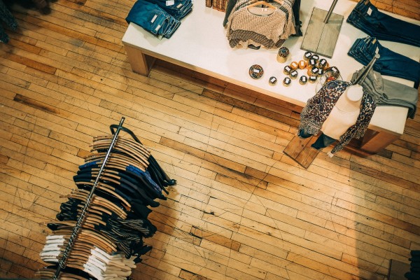
In apparel, mannequins are one of the most effective displays in showcasing your clothing items as worn.
Point of Purchase Display
Having relevant products displayed at the checkout tends to sell well as impulse purchases. As such, this area is often optimized for trending items, seasonal good, or accompanying purchases.
Music
While not a visual aspect, music can still have a significant impact on a customer's mood and is an important factor to consider.
Essentially, your retail space has to be your most productive and most efficient salesperson you have. So how do you go about optimizing your sales space for maximum revenue? By creating optimized and eye-catching visual merchandising displays.
Research by Dunne and Lusch (2005) suggests that the store environment is an important element in retailing and that 70% of purchases are an impulse buy or unplanned purchase. It’s important to note that the following 8 tips apply to a range of retail stores. So, let’s get started…
Tips for visual merchandising in your retail store
1. Always have your target customer in mind
Knowing your target customer is vital for creating effective merchandising displays. Being familiar with demographic data, like age and income, will help, but it’s also important to dig deeper, so you’re targeting not just individuals, but their lifestyles.
If you’re having trouble finding inspiration, you can find unlimited imagery and ideas online by making use of articles, blogs, and Pinterest.
2. Have a plan
Visual merchandising can be overwhelming, especially when you have a wide range of different products. Firstly, you must decide what you will be merchandising and what fixtures and props you will need to display them effectively. Many businesses use a planogram to do this.
A planogram is a diagram of your shop floor that will help you to plan where you are placing your products. This can be done using specialist software, or you can use a pen and paper to sketch a plan - the latter won’t be as accurate as a digital design, but it can still help you to visualize the display before setting it up. This will prevent you from moving stock back and forth and getting muddled.
3. Use your windows to increase footfall
Your shop windows are the first thing a potential or current customer will see when they come across your business. Having an excellent window display or attractive exterior is one of the fastest techniques to drive customers into your business.
An eye-catching display will encourage local, passing, repeat, and first-time trade into your store, so it’s important that it is attractive, crisp, and clean. Windows are an excellent place to display new products or products that you are looking to push sales on.

In order to create and maintain interest, it’s recommended that your displays can be altered regularly to create and maintain interest. Retailers should really change their window displays at least six times a year. This is very achievable and allows you to be flexible with changing seasons and themes.
You can base your theme around special events like Mother’s Day, Valentine’s Day, and Christmas. Obvious factors like ensuring your windows are clean will make a substantial difference to the success of your displays.
4. Start closest to the door
Once your customer has spotted your window display and entered your store, the first products they see must do your display justice. Many successful businesses place their newest and most expensive items at the front of the store, so customers don’t have to search for what’s new.
If customers like what they see in the window, they will likely want to have a closer look at these particular products.
5. Reinforce advertising
Your visual merchandising should strengthen any print, television, or radio advertising that you have running. If you have a slogan that you use in advertising, repeat it on displays in your store. This will create a consistent brand image and will ensure that your advertising compliments your business in the flesh too.
6. Merchandise in a way that customers can identify with
A customer will typically want an idea of what the item will look and feel like. To accommodate this, it’s important to set up your merchandise in a way that will help customers visualize how a product will look in their home, or on themselves.
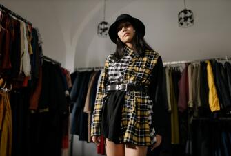
For example, in a furniture store, the products are set-up with displays that make it easy for people to envision how the same products could be set out in their own homes. In fashion retail, this is done by dressing mannequins in products and implementing a uniform for staff, which includes wearing the clothing you sell. It’s surprising how much seeing an item being worn can help to sell a product.
7. The rule of 3
Visual merchandisers will often refer to the rule of three, which means that when creating a display, products will look more visually pleasing when arranged in sets of three. For example, if you were arranging products by height, you’d have items that were short, medium, and tall. The reason for this is that our eyes are most likely to keep moving and looking around when we look at something asymmetrical.
8. Placement is key
It may sound cliché but “eye level is buy level”. Shoppers like to feel and touch things and prefer items to be within their arms’ length, so make sure your best products are easily accessible to create a more tactile experience for your customers.
Grouping products with similar items will give your customers additional reasons to buy more items from you. It will also save your customers time from looking around and trying to mix and match things, so their shopping experience will be more relaxed and enjoyable.
Your products can also be categorized by color, price, size, or type. Visual merchandising in this way can boost the number of impulse purchases that your customers make. Additionally, placing low-value products at the till point is likely to encourage customers to make a last-minute purchase that will increase your ATV in-store.


