5 Eye-Catching Brand Identity Examples
There are many elements that go into creating a solid branding strategy for your business, and brand identity is one of them. You’ll want to create an identity that reflects your company values, and resonates with your target audience. Once you have identified what matters to your company, what your business is trying to achieve, and how you want to achieve it, figuring out your identity should be easy.
We explore the meaning of brand identity and share 5 great brand identity examples you can take inspiration from today.
What is brand identity?
Brand identity is the visual execution of your branding strategy. Your branding strategy is how your business intends to communicate with its intended audience. It’s the steps you take and the words you use that encourage customers to opt for your product instead of your competitors.
Your brand identity and strategy try to capture the message your company wants to share while reflecting what customers’ expectations and want to hear from your business.
Basically, identity is how your business looks and communicates with potential and existing customers. It includes:
- Logo
- Font
- Colour scheme
- Tone of voice
- Choice of words and slang
The visual identity of your business should be consistent across all platforms that customers can reach you. It’s a style that should be unique to your company in order to attract the attention of customers and make your business stand out against a wall of competitors. You’ll want cohesive branding across:
- Customer service and marketing communications
- Slogans and taglines
- Graphics and images
- Product line
- Packaging
- Merchandise
- Social media
- Business cards
- Website design and wording
While you can’t exactly control how customers feel about your business, your brand identity will help form opinions, and affect how people interact with your brand. It’s the tangible elements of your brand that influence how people think, and how they recognize your business.
Brand identity examples
These examples have been chosen for the distinctive visuals and instantly recognizable messaging.

Headspace
Headspace is a mental health, mindfulness and meditation brand. They use a calming, pastel-like color scheme and cheery illustrations that are intended to serve the brand's purpose of bringing joy and relaxation to its users.
Headspace have released their entire design guide for the public to download. Here, they note their most important principles and goals when designing the app and website. They include good design, unified experiences across all platforms, bringing personal value to users, remaining true to Headspace’s core principles, and reflecting the brand’s personality [1]. Their branding is extremely effective; Headspace recently celebrated a milestone of having one million paid subscribers [2].
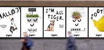
Flying Tiger Copenhagen
Flying Tiger’s brand identity perfectly captures the message and personality of the brand. Despite having a black logo, the playful typography and cute googly eyes graphics makes it instantly recognizable and emits a creative and fun vibe. Of their logo, Flying Tiger Copenhagen says it represents who the brand are: “surprising, adventurous, and Danish” [3].
The design of their store and ecommerce website are also perfectly suited to the brand’s mission statement:
“We design and sell products that bring you closer to someone else, and all products in our stores, even the small, simple or seemingly just funny items, are designed to make relations happen and people happy” [4].
Flying Tiger Copenhagen’s focus on fun, silliness and wholesomeness are immediately extremely clear through their hand-drawn illustrations and friendly visual elements.

The Ordinary
The Ordinary is a skincare brand whose primary selling point is the simplicity of the products. Many credit the popularity of The Ordinary products with the simplicity of their product naming. They are hailed for naming their skincare products after their main ingredients, and many other skincare brands have tried to follow suit with this idea.
For example, one bottle of The Ordinary’s most popular product, Niacinamide 10% + Zinc 1% Serum, sells every three seconds [5]. It’s named after its two main ingredients. All The Ordinary products are named this way, other examples include Matrixyl 10% + HA, and Ascorbyl Tetraisopalmitate Solution 20% in Vitamin F.
Even the makeup line is rooted in being straightforward and direct. Their concealer is simply named ‘Concealer’. It’s difficult to avoid drawing comparisons between makeup market leader Charlotte Tilbury’s approach to naming concealers. Despite having enchanting and dressed up names for their products like ‘Magic Away Liquid’ and ‘Hollywood Flawless Filter’, The Ordinary stay true to their roots by branding their rival product with a simple, honest name. It’s a sign of a confident, strong brand identity.
The Ordinary proudly brand their monochrome packaging, matched with product names that sound like something you’d find in a science laboratory. It may have seemed like a bold move in the beginning, however, the simplicity and transparency of The Ordinary is what makes it so popular and accessible to users. It’s clear to see that the brand identity is completely led with this in mind.
Nandos
Nando’s is a global chicken restaurant, which has proudly placed its South African and Portuguese roots at the heart of its brand identity. The design of all Nando's restaurants is instantly recognisable by the vibrant colour palette displayed in the restaurant’s interior design and crockery, rustic combination of stone and wooden furniture, and traditional Afro-Lusophone music. They’re recognised as leaders in restaurant branding, if you walked into a Nando’s restaurant where there was no logo and signage, you’d instantly recognise it as a Nando’s.
The logo has Portuguese origins too; the rooster, known as the Galo de Barcelos, symbolizes both a love of life and good fortune in Portuguese culture. Paying homage to its roots, Nando’s have named their iconic logo and ‘chicken sticks’ that appear on all tables Barcis.
An unconventional combination of fire, a black rooster and a red heart come together to create a brand identity that is family-friendly, authentic and recognisable, all while being steeped in cultural history.
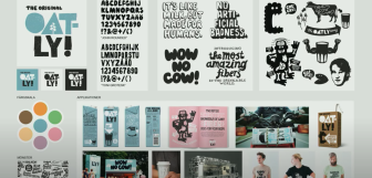
Oatly
Oatly is a dairy-free, vegan-friendly oat milk company. They’ve been around since 1994, however, the brand has only achieved remarkable growth since 2012, when they rebranded.
Their brand elements centre around Oatly’s focus on being environmentally friendly while remaining upbeat and humorous at the same time.
Their mission to be bold game-changers is summed up perfectly in their bold, eye-catching logo design, stamped with a blocky exclamation mark. John Schoolcraft, Oatly’s creative director, recently gave an interview about Oatly’s rebranded packaging and refreshed brand identity. “Someone said this was the worst, most childish packaging they had ever seen and why was I ruining this company” [6].
Despite this, Schoolcraft said that Oatly is fearless. Even while rebranding, which he claims is many brands’ worst nightmare, he said that Oatly’s creative team decided that drastic change was needed for dramatic results. Their punchy marketing strategies include a poster that says “Are you stupid? The milk lobby thinks you are.” [7] It’s attention-grabbing, direct, and unapologetically Oatly.
Within this interview, John Schoolcraft also shared his three top tips on transforming creative culture in the workplace.
- Take action, don’t just talk about change. Revealing the new packaging demonstrated the new direction to the company more than any words could.
- Remove fear from the culture. Make people feel safe and secure enough to make the right decisions for the company.
- Inspire the people who are working at the company to think that this time right now in their career is going to be the best period of their professional lives. No one is holding them back.
Epos Now
Whether you’re creating a branding strategy for a hospitality business or a retail business, Epos Now have software that caters to the specific needs of your industry.
Another way to establish your company’s brand is to design creative marketing campaigns. With effective marketing outreach, you’ll be able to drive repeat business, increase customer retention, and establish customer relationships that could last a lifetime.
Encourage business growth, and create stunning marketing campaigns right from your point of sale (POS) system when you choose Epos Now.
- Choose from 100s of captivating templates to create an email campaign that suits the visual identity of your business
- Track open and clickthrough rates of your campaigns
- Conduct A/B testing to see which campaigns are working the best
- Import Epos Now customer data for more effective, personalized emails
- Convert lost sales by sending reminders about abandoned shopping carts
- Customize your emails with an easy-to-use drag and drop builder
- Build automated campaigns that follow a set sending schedule