Restaurant Design Ideas For Your Food Service Business
It's 2024 and just having tasty food in your restaurant isn’t going to cut it anymore. With Millennials, Gen Z, and even the Gen Alpha kiddos on the scene, the whole restaurant game has changed. They don’t just want a meal. No, they want an experience.
They’re all about finding cool spots that look great on Instagram (because if it’s not on the 'gram, did it even happen?) They want a place that’s comfy, stylish, and has some serious vibes. Oh, and they’re into eco-friendly and techy stuff too. It’s not just about what’s on the menu anymore.
According to PYMNTS, 37% of diners use social media to find their next restaurant outing. That’s why we’re giving you the 411 on how to make your restaurant pop. Keep reading, because these tried-and-tested tips will help you create a space that’s not just a restaurant, but a must-visit destination.
Choose the right colors, acoustic and lighting for seating strategy
Alright, let’s get into the fun stuff—choosing the right colors, acoustics, and lighting for your seating strategy. Trust us, this can make or break the vibe of your restaurant.
Colors first
Think about the mood you want to set with your restaurant branding. Want a chill, relaxed atmosphere? Go for cool tones like soft blues and greens. They’re soothing and perfect for a laid-back dining experience. If you’re aiming for energy and excitement, warmer colors like reds, oranges, and yellows should be your go-to. But be careful, too much red might make your place feel like a fast-food joint (unless that’s your thing). Earthy tones like browns and tans can give off cozy, homey vibes, which is great if you want people to feel like they can hang out for a while, or if you're going for a more elegant or bold aesthetic, consider using a deep burgundy color.
Acoustics
This one’s sneaky but super important. If your place gets too loud, people won’t stick around long (and they might not hear each other over dinner). Soft furnishings like cushions, curtains, and even wall tapestries can help absorb sound. If you’ve got a big open space, think about adding some dividers or plants (bonus: they look great too). Some restaurants even go the extra mile and install acoustic panels on the ceiling—so no more shouting across the table to be heard.
Lighting
The key here is layers. Overhead lighting can set the general tone, but it’s the softer, more focused lighting that creates the ambiance. Think warm, dimmable lights for evening dining—nothing kills the mood like a spotlight on someone’s plate. Pendant lights over tables are a great way to create intimate spaces, even in a bigger room. And hey, don’t forget about natural light during the day—big windows can make your space feel bright and welcoming.
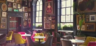
Balance comfort and style with your chosen decor
Let’s talk about balancing comfort and style with your decor. Because, honestly, what’s the point of a beautiful space if no one wants to hang out there?
First up, comfort. When people go out to eat, they want to relax. So, make sure your chairs are comfy, your booths are cushy, and there’s enough space for everyone to spread out a bit. No one likes a stiff chair, no matter how cool it looks. Soft seating and cozy spots will keep people happy and lingering longer.
But of course, style matters too. You want your place to look awesome, right? The trick is finding pieces that are both comfy and stylish. Think about mixing materials—like pairing a plush seat with a sleek metal frame. Or add some personality with patterned pillows or funky light fixtures. These little touches can make your space stand out without making it feel less inviting.
Here’s a tip: Don’t go overboard with the decor. Sometimes, less is more. Stick to a theme that fits your restaurant’s vibe, whether it’s modern and sleek or cozy and rustic. You want people to feel at home but also be wowed when they walk in.
Create an accent wall
Flower murals, funky wallpaper, or exposed brick—your accent wall can make your restaurant stand out from the crowd. It's not just a background. No, it’s a chance to show off your style and set the mood.
An accent wall isn’t just about looking cool. It helps set the tone for your space and creates a killer first impression. It’s a fun way to add some personality and make your place feel unique and welcoming. Whether you go for a vibrant mural, quirky wallpaper, or classic brick, it breaks up the usual and keeps things interesting. Plus, it’s a great spot for diners to snap pics for their socials, which means more buzz about your awesome spot. So go ahead and let your accent wall do the heavy lifting in making your restaurant stand out!
Highlight key areas for a better dining experience
Let’s talk about making your dining area a hit by highlighting the key areas that really matter.
Kitchen area
Make sure your commercial kitchen layout is on point (because we all know a chaotic kitchen is a recipe for disaster). It doesn’t have to look like a sterile lab, though—throw in some natural materials and cool design elements to keep things looking sharp. An organized kitchen doesn’t just make your staff happy. It also adds to the overall restaurant ambiance and shows off your style.
Bar
Ah, the bar area—the heart of the party. This is where you want to make a splash (literally and figuratively). Choose bar furniture and decor that scream your restaurant’s style. Think cozy booths and sleek bar stools that invite guests to linger for one last drink. Lighting is key—warm, soft lights can make your bar the go-to spot for a chill evening.
Restrooms
Yes, you read that right, restrooms. They might not be the most glamorous part of your restaurant, but they matter and you need to focus on making them impressive. No one wants to be greeted by a dingy bathroom. Keep them clean, bright, and stylish. Add some plants or a snazzy restaurant wall decor to make them feel a little special. It’s all about leaving a good impression—even in the bathrooms.
Add different types of art to your dining room
Now, we’re not saying you need to turn your restaurant into the Louvre (though that would be pretty cool), but adding some art can seriously up your game. Imagine having local art on your walls—it’s a great way to support local artists and give your place a unique, personal touch. Plus, it’s perfect for sparking conversations.
If you’re going for a more upscale vibe, consider hiring an art director. Just like restaurant like Soho House, you can get someone to commission amazing pieces that’ll really wow your guests. And don’t forget textural art like cool tapestries or metal sculptures—they add a whole new layer of interest. With the right art, your restaurant, cafe or lounge interiors will be a spot everyone remembers.
Match your ceilings and floors to your restaurant’s concept
You don’t need cathedral ceilings with dramatic wooden beams to make your ceiling stand out. Even if your ceiling is pretty standard, you can still make it a focal point with some clever touches.
Add a splash of color or experiment with unique finishes to give your ceiling some personality. Consider incorporating suspension art or lighting fixtures that draw the eye upward. It’s all about turning that overhead space into something special that adds to the overall vibe of your restaurant. With a little creativity, your ceiling can go from bland to grand, making your space feel more dynamic and engaging.
Combine different materials for a creative ambiance
Mixing different materials can seriously amp up the ambiance in your restaurant. It’s all about blending textures and finishes to create a space that feels both dynamic and inviting. Imagine pairing sleek metal fixtures with warm wooden tables or combining polished concrete floors with cozy, plush seating. This mix of materials adds depth and interest, making your restaurant more engaging and visually appealing.
Don’t be afraid to experiment. You could match industrial elements like exposed pipes with soft textiles for a modern yet comfy vibe, or contrast rustic wooden beams with chic glass details for a unique touch. Combining materials isn’t just about aesthetics; it’s also about creating a space that feels layered and thoughtful. With the right mix, you’ll have a restaurant that’s not only stylish but also memorable, giving your guests a fantastic experience from the moment they walk in.
Add the perfect balance of technology for a minimalistic design
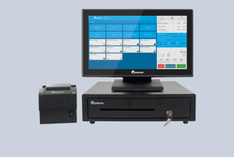
Getting the balance right between tech and minimalism can really up your restaurant game. You want your POS terminal to work smoothly without messing with your sleek look. Go for compact, stylish terminals that blend right into your space—no clunky gadgets here!
Imagine using digital menus on sleek screens or tablets that keep things modern but don’t clutter up the place. It’s all about integrating cool tech in a way that feels natural and fits with your design. When done right, tech can enhance the vibe and make everything run smoothly, all while keeping your restaurant looking fresh and streamlined.
Gain all the advantages of a POS system with detailed, flexible, downloadable reports, and so much more.

Factors to consider when designing your ideal restaurant space
When you’re dreaming up your ideal restaurant space, there are a few key things to think about:
Your target audience
First up, who’s your crowd? Know your target audience—are they families, foodies, or late-night partiers? This helps you nail down everything from the vibe to the menu.
Type of restaurant
Next, consider what type of restaurant you’re going for. Are you opening a cozy café, a trendy bistro, or a swanky fine dining spot? Your style will guide how you design the space and map out your restaurant floorplan.
Budgeting
Let’s talk budgeting—because money matters. You want to get the most bang for your buck, so plan out what you can afford for things like furniture, decor, and technology. Be realistic about what you can spend and prioritize the essentials to keep your restaurant looking and running great without breaking the bank.
TIP: Fast-track your business dreams with Epos Now Capital. It provides SMEs with business cash advances up to $1,000,000.With no business plan required, our cash advances can be used for restaurant design, marketing investment, inventory purchasing, cash flow management, or simply to overcome unexpected business interruptions.
FAQs about restaurant design ideas
- What type of layout is best for restaurants?
-
It really depends on the vibe you’re going for. For a casual spot, an open layout with flexible seating works great. If you’re aiming for something cozier or more upscale, try a mix of intimate booths and open tables. Just make sure it flows well and keeps things comfortable for your guests.
- What is a good size for a small restaurant?
-
A good size for a small restaurant is typically between 1,000 and 2,500 square feet. This'll give you enough space for a decent number of tables and a cozy vibe without feeling cramped.
- How much does it cost to design a restaurant?
-
Restaurant interior design can cost anywhere between $85 to $500 per square foot, including build-out. This range depends on your style, location, and how fancy you want to get. Plan your budget based on your needs and priorities to get the most out of your money.


